


Monday, October 25 2010 - 8:26 PM
By: Neoriceisgood
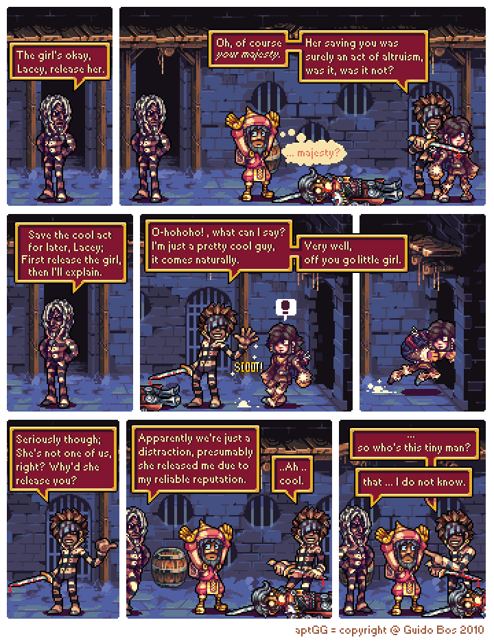

The great escape #5
Here's this week's update, hope you guys like it.
For those wondering, I've buffered up 2 pages so far, hope to get at least one page done each day of this calm week before intern leaving me with around 9, exactly what I'd need in case I find myself so busy during intern that I can't even make a single page.
Obviously I'm hoping that won't be the case, but I'd be prepared.
Otherwise, vote, comment and post on the forums.
I love you guys.
- Neorice
Update buffers are good. :D
something weird is afoot
Oh, goodness. So many glorious questions, so much silliness, and the only question we need to know is: Where is Burke?
¨Your Majesty¨? Gosh darn it, more mysteries! xD
Nice update, things got settled down. And now the question is if the focus will change to a certain pant-less fellah...
While the new speech bubbles give a more unified look to the comic as a whole, the text is pretty hard to read, especially when italicized. Are you really sure you're going to continue using it rather than going back to the old speech bubbles? I would hate to give up on a great comic art- and story-wise because it's become unreadable. D:
I'm definitely not going back to the -old- speech bubbles, but if I can find a pixel-like font that's more readable than this one, I wouldn't object changing.
The only big reason I'm using this font right now is the fact that it's the only font I know that's small enough for it to be shown at 2x the size, like the rest of the comic.
Maybe you could try creating a custom font?
http://www.instructables.com/id/How-to-make-custom-fonts/
I like the idea of regular updates! The story seems to move quicker again. I also think the font can be improved and the black line around the speech bubbles is much better! I have the fear though that dialogues will become much shorter with any pixel font. The dialogues so far have always been great and I wonder whether with the new font this is still possible. If less text fits on a page, this may also slow down the story and with different strands this may lead to a very slow pace. But in general: awesome work!
@Glo
I've tried the font on more text heavy pages, the only "big change" is that it means feet not showing from time to time.
I want to avoid pages becoming text attacks in a negative sense either way, sometimes comics cram so much text on a single page that I just can't handle it, this just means I literally can't make that mistake, in some ways. :)