...but if it isn't a spoiler it eliminated the possibility that he will and thus spoils by omission...
2551: giovanni - Monday, April 11 2011 - 5:48 AM
its tobi in the comments!
2552: someone - Monday, April 11 2011 - 7:09 AM
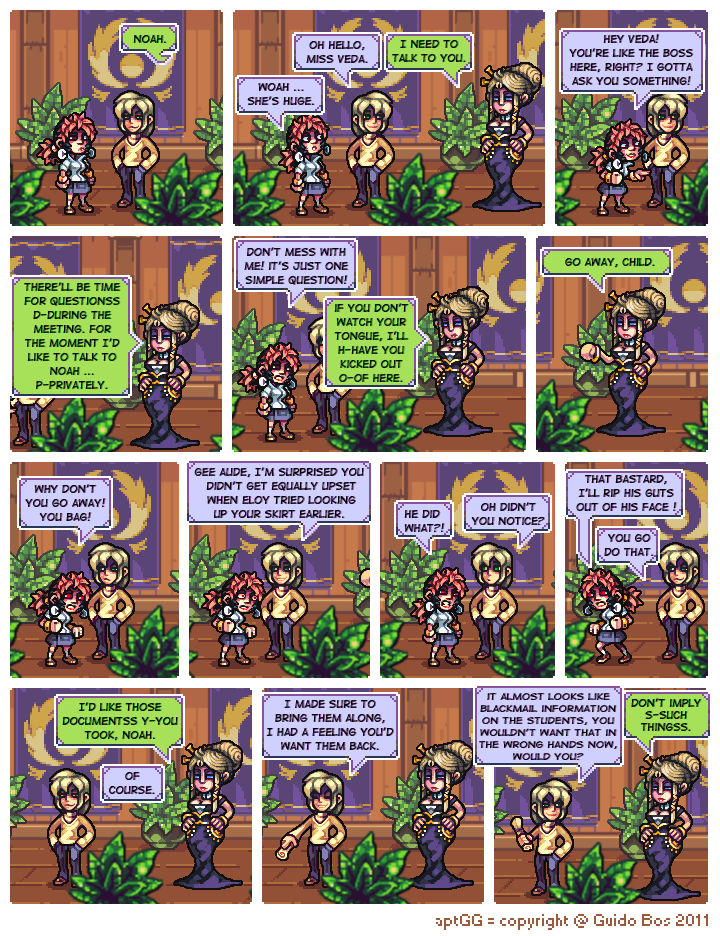
I understand Noah's smugness. When your friends are so easy to manipulate, it induces smugness all the time.
This is a proven fact. However, beware! If you manipulate your friends too much, they can become contaminated by your smugness and become even smugger than you are!
2553: Droidette - Monday, April 11 2011 - 8:07 AM
Now that it's been a couple pages with the new style, not that many i know, but i definitely liked the previous style much better. It looked like actual pixel-art.
But from what i read in the comments everyone seems to love this new style, and i admit it's not bad, i just really enjoyed the other one a lot more. :)
2554: yeahthatguy - Monday, April 11 2011 - 8:31 AM
Sounds like a Dominic Deegan plot.
2555: Ceata88 - Monday, April 11 2011 - 11:57 AM
Omfg, cute Tobi is cuuuuuute
and yeah, easiest way to side track a violent chick is give her something else to yell at.
2556: ADHadh - Monday, April 11 2011 - 12:12 PM
I'm not sure about the new Tobi. She's always looked more like a bulky girl to me. Not fat, but rather muscled – a girl that did some hard work, you know.
Also, I wonder if Veda is supposed to be extraordinary tall or are Noah and his pals younger/smaller than I thought? Then again she might be wearing heels.
I agree with Droidette to a degree; the previous style had a certain charm, though I can see how this one is a lot more flexible. Only beef would be that last Burk pages were mostly dark, while those are very bright, which takes time to get used to (but it surely accentuates the switch of focus).
2557: Drake_Pegasus - Monday, April 11 2011 - 12:59 PM
I like the new Tobi! She looks much more casual-and human-than the rest of the girls in this art style.
2558: Jayrizo - Monday, April 11 2011 - 4:01 PM
In my opinion, the new Tobi seems just a shade too, er, dark. Maybe 's just me.
2559: Sploder - Monday, April 11 2011 - 6:34 PM
Sadly, I'd have to agree with Droidette. While the new style certainly looks fairly good, it looks much less like typical pixel-art, which was part of this comic's appeal for me.
However, I don't particularly mind if you continue to use it, and obviously, the decision is entirely up to you. This style also looks like its slightly easier than the previous one, since you have a bit more space for details and such.
2560: Jaqexizr - Monday, April 11 2011 - 6:59 PM
Tobi looks great! Can't wait to see how 3 looks!
2561: Inanimate - Monday, April 11 2011 - 9:09 PM
Agreed, Jayrizo. Her nose seem odd, too...
2562: Mezzaphor - Monday, April 11 2011 - 9:44 PM
Of course Tobi's dark. She lived in a desert.
2563: TCF - Tuesday, April 12 2011 - 12:34 AM
Hey Neorice, how do you go about choosing your pallet?
2564: Neoriceisgood - Tuesday, April 12 2011 - 12:48 AM
@TCF
I tend to just pick whatever colour I need, but I doubt that's the answer you're looking for so:
1. I tend to make my palette up as I go, I don't pre-asemble palettes.
2. The one exception is if I've got the perfect/near perfect colour in another character.
3. I tend to have certain rules to the colours I pick such as;
-> It's saturation tends to be low to middle, almost never high. (though I've been experimenting more with high saturation in places lately)
-> I try to change hue inbetween each shade, shadows tend to be less saturated and have a hint of blue, highlights tend to be yellower.
-> I try to make my higlights feel almost cellshaded in how strong they are when I can, I add more shading than a simple cellshaded style, but do want to stick to very clear and basic contrast rules when it comes to dark and light spaces.
I hope this answers your question!
2615: Chevsky - Thursday, April 14 2011 - 8:52 PM
"Sounds like a Dominic Deegan plot."
The level of smugness certainly supports this notion. Now if only someone gets punched in the balls soon... ;)


...but if it isn't a spoiler it eliminated the possibility that he will and thus spoils by omission...
its tobi in the comments!
I understand Noah's smugness. When your friends are so easy to manipulate, it induces smugness all the time.
This is a proven fact. However, beware! If you manipulate your friends too much, they can become contaminated by your smugness and become even smugger than you are!
Now that it's been a couple pages with the new style, not that many i know, but i definitely liked the previous style much better. It looked like actual pixel-art.
But from what i read in the comments everyone seems to love this new style, and i admit it's not bad, i just really enjoyed the other one a lot more. :)
Sounds like a Dominic Deegan plot.
Omfg, cute Tobi is cuuuuuute
and yeah, easiest way to side track a violent chick is give her something else to yell at.
I'm not sure about the new Tobi. She's always looked more like a bulky girl to me. Not fat, but rather muscled – a girl that did some hard work, you know.
Also, I wonder if Veda is supposed to be extraordinary tall or are Noah and his pals younger/smaller than I thought? Then again she might be wearing heels.
I agree with Droidette to a degree; the previous style had a certain charm, though I can see how this one is a lot more flexible. Only beef would be that last Burk pages were mostly dark, while those are very bright, which takes time to get used to (but it surely accentuates the switch of focus).
I like the new Tobi! She looks much more casual-and human-than the rest of the girls in this art style.
In my opinion, the new Tobi seems just a shade too, er, dark. Maybe 's just me.
Sadly, I'd have to agree with Droidette. While the new style certainly looks fairly good, it looks much less like typical pixel-art, which was part of this comic's appeal for me.
However, I don't particularly mind if you continue to use it, and obviously, the decision is entirely up to you. This style also looks like its slightly easier than the previous one, since you have a bit more space for details and such.
Tobi looks great! Can't wait to see how 3 looks!
Agreed, Jayrizo. Her nose seem odd, too...
Of course Tobi's dark. She lived in a desert.
Hey Neorice, how do you go about choosing your pallet?
@TCF
I tend to just pick whatever colour I need, but I doubt that's the answer you're looking for so:
1. I tend to make my palette up as I go, I don't pre-asemble palettes.
2. The one exception is if I've got the perfect/near perfect colour in another character.
3. I tend to have certain rules to the colours I pick such as;
-> It's saturation tends to be low to middle, almost never high. (though I've been experimenting more with high saturation in places lately)
-> I try to change hue inbetween each shade, shadows tend to be less saturated and have a hint of blue, highlights tend to be yellower.
-> I try to make my higlights feel almost cellshaded in how strong they are when I can, I add more shading than a simple cellshaded style, but do want to stick to very clear and basic contrast rules when it comes to dark and light spaces.
I hope this answers your question!
"Sounds like a Dominic Deegan plot."
The level of smugness certainly supports this notion. Now if only someone gets punched in the balls soon... ;)